
Sometimes, done really is better than perfect. It's an easy principle to believe in and a difficult one to practice, especially when your name is attached to the work.
There is always one more thing to refine: a spacing value that feels slightly off, a sentence that could be sharper, a color that almost works. At some point, refining stops serving the work and starts delaying it. LaidbackLab's website knew that stage well.
What follows is an account of how it finally shipped. It covers how the site took shape, where its visual direction came from, the tools underneath it, the role AI played, and the lessons worth carrying into whatever comes next.
A studio needs a front door
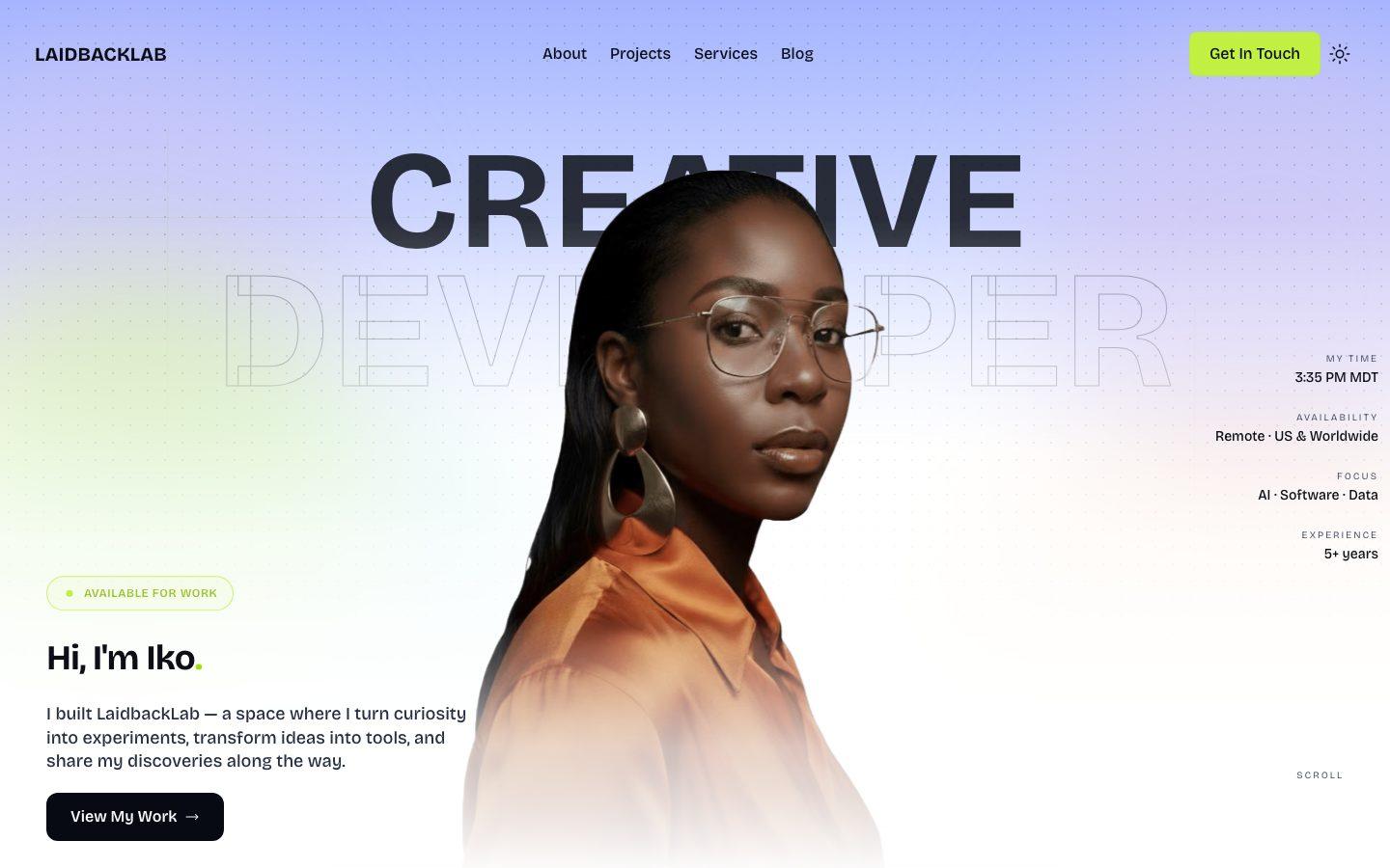
LaidbackLab is a creative studio, and each project starts with a question, an idea, or a problem worth solving. Web platforms, mobile apps, AI-powered tools, and small utilities that make everyday digital life a little easier. The lab isn't tied to one medium or one kind of problem. It follows the ideas that seem worth pursuing.
Until now, that work didn't have a home of its own. Products lived as repositories, prototypes, and notes. The website changes that. It's one place where each product can be found, where the thinking behind it is visible, and where anyone curious can see what the lab is working on next.
The name shaped how the site should feel. It brings together two ideas that seem to pull against each other. A lab is curious, experimental, and always changing. Laidback is slower, quieter, and unconcerned with unnecessary noise. The studio sits somewhere between the two: serious about the work, relaxed about everything around it. The site needed to feel the same way: calm on the surface, with plenty of room to experiment underneath.
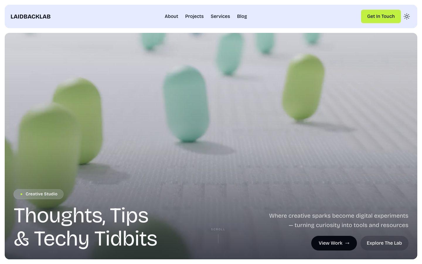
Why it took a while
It took a while, and for good reasons. Some of that was the work itself. A design system was built, taken apart, and rebuilt. A color theme was replaced. Pages were refined once they went live, because real content reveals what mockups hide.
The rest came down to standards. The site worked well before launch, but it stayed private until it represented the studio the way it should.
The process was iterative, the way most creative work is. Design, development, and writing overlapped constantly, and much of the effort went into what visitors feel rather than see: performance, accessibility, and a clean architecture. These are the phases that shaped the site the most.
- Phase 01The first sketchesBefore the current build, the site started as an experiment: early layouts, first references, and a rough sense of what the studio should feel like.
- Phase 02The foundationNavigation, theming, and a working contact form came first. Soon after, every main page existed in some form: home, blog, projects, and about.
- Phase 03RefinementCode conventions, naming, and careful refactoring. The accent colors were consolidated, and the About page found its structure.
- Phase 04Motion and polishParallax, clip-path reveals, and staggered entrances, followed by SEO, accessibility, spam protection, and analytics.
- Phase 05PerformanceLighter images, a smaller hero video, better caching, and a redesigned About hero.
- Phase 06The detailsLegal pages, a much fuller About page, and dozens of small design fixes.
- Phase 07LaunchA launch announcement, visitor tracking, and this journal.
Looking while building
Research didn't come first, and it didn't happen all at once. It ran alongside the build. A section would get built, then compared against how other studios had solved the same problem, then reworked. Sometimes the research sent the design somewhere new. Sometimes the build showed that an idea only looked good in someone else's context.
Over the course of the project, that meant hundreds of references: studio portfolios, product sites, Framer and Webflow templates, Dribbble shots, Pinterest boards, UIverse components, and countless other places to find good ideas. If someone had solved a detail better than I had, I wanted to see how. Some influenced the visual direction. Others shaped the content itself: which sections a studio homepage needs, what an About page should lead with, and how much to say before saying less.
The four below are a small selection of the references I used while building the site. This list may grow or change as the site evolves.
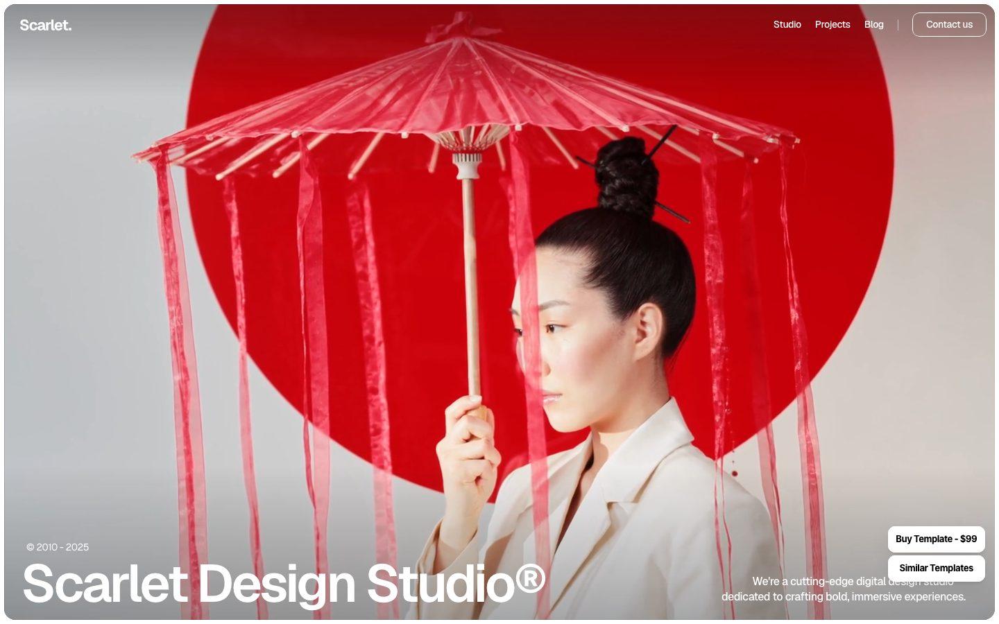 ScarletMoves through work, process, FAQ, and blog without ever feeling crowded. That sequence informed the structure of the LaidbackLab homepage.
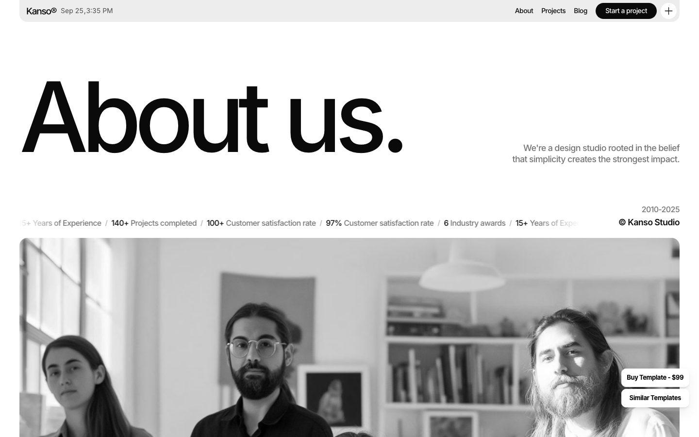 KansoThe About page leads with beliefs before credentials. It's where the studio's operating principles started.
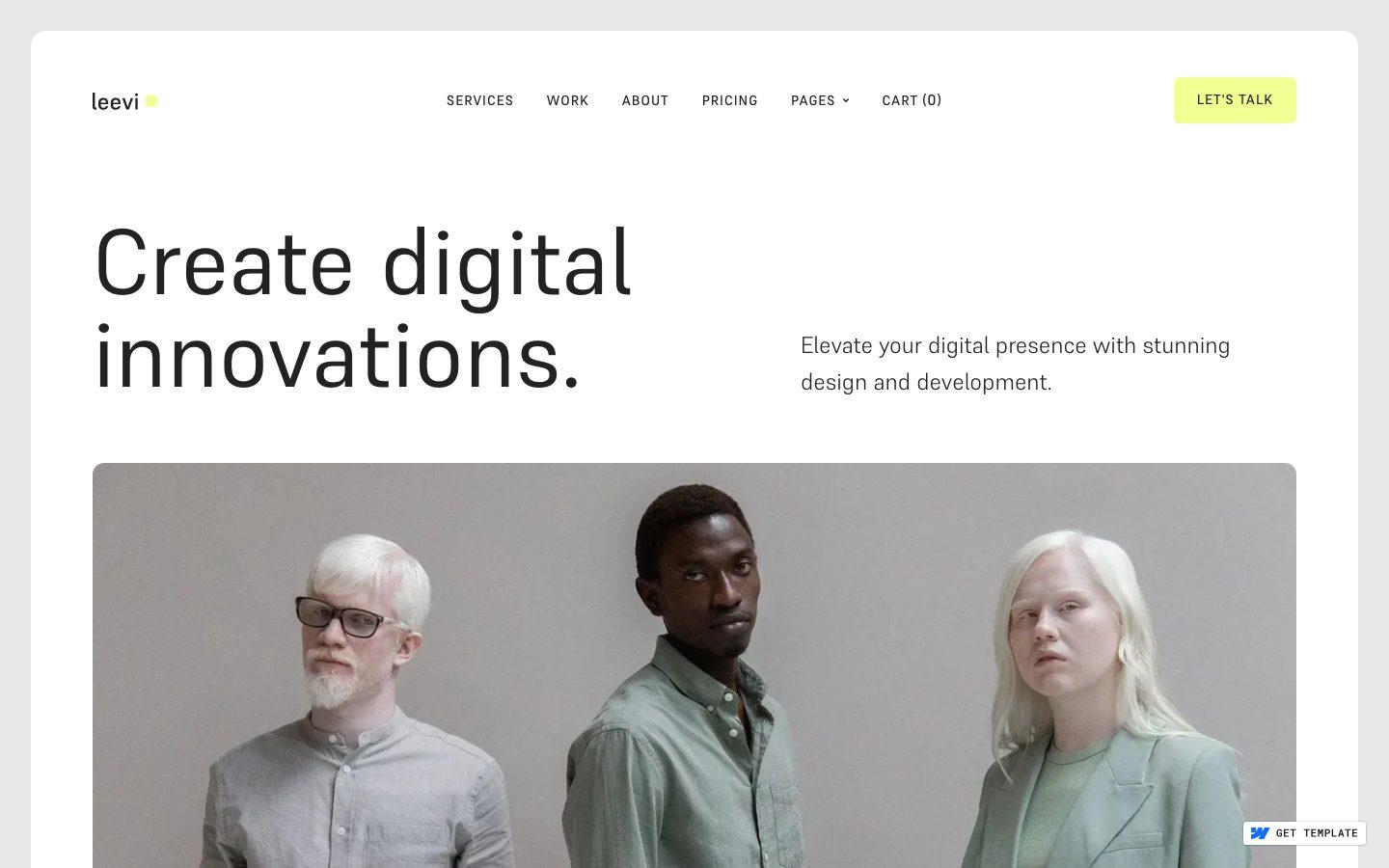 LeeviA bold headline over a full-width visual. LaidbackLab uses video instead of a still, but the instinct is the same.
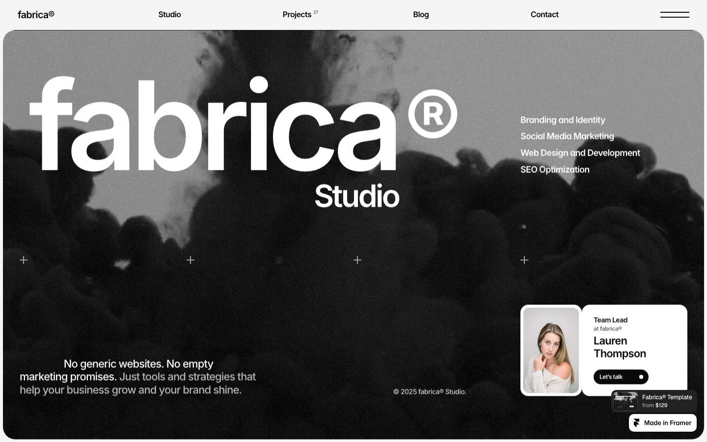 FabricaShort, direct copy like "No generic websites." It made a case for saying what the studio won't do, not only what it will.
Finding the look
The visual identity wasn't designed in a single pass. It was found through iteration, and most of that iteration was thrown away.
Typography went through several rounds before it settled. Bricolage Grotesque now carries almost everything, and Crimson Pro is reserved for moments that call for a softer, more literary voice.
Color went further. After a long stretch of refining one palette, I replaced it altogether. The deep navy base came out of that decision, along with accents that shift with the theme: lime leads in light mode, and orange takes over in dark.
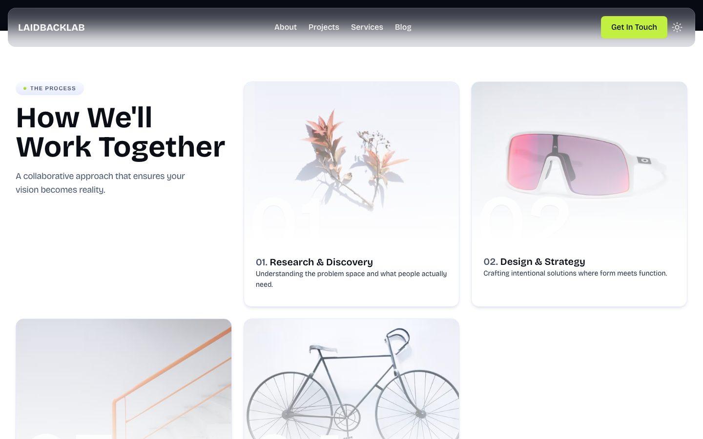
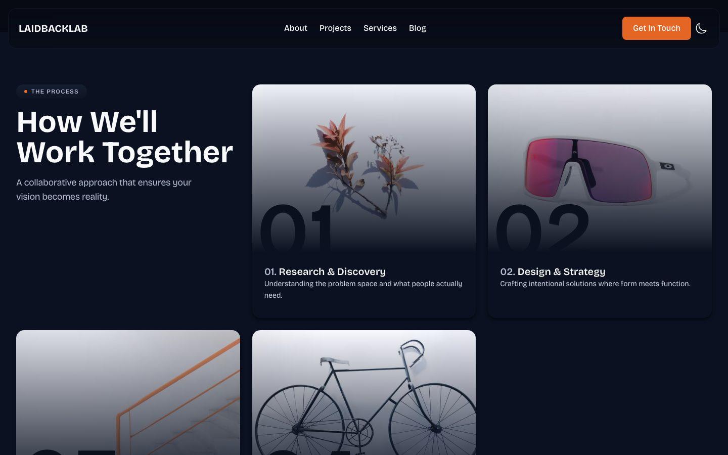
Layouts and sections were treated the same way. They were built, moved, merged, and removed until each page read the way the studio should: calm at first glance, with depth for anyone who looks closer. Some of the most important decisions on the site are the versions that didn't survive.
Motion follows the same principle. It sets the pace rather than performing. Sections arrive as you reach them, so the page reads in the order it was written.
The tools underneath
Nothing exotic here. Each tool does one job well, and none of them get in each other's way.
- Next.jsFramework
- Pages, SEO metadata, image optimization, and the contact form's API all live in one project, with one deploy.
- TypeScriptLanguage
- It catches small mistakes before the browser does. On a solo project, there's no one else to catch them.
- Tailwind + CSS ModulesStyling
- Tailwind for speed, CSS Modules for the few components that need their own rules. Colors live in CSS variables, so dark mode is a swap instead of a rewrite.
- Framer MotionAnimation
- Motion is a big part of how the site feels. This keeps parallax, reveals, and staggered entrances manageable.
- next-themesDark mode
- Follows your system setting, with a toggle for when you disagree with it.
- Resend + React EmailContact form
- Contact form emails are React components, so they look like the site instead of a plain form mailer.
- reCAPTCHA v3Spam
- Paired with rate limiting. Spam is the first visitor any contact form gets.
- VercelHosting
- Deploys from main and stays out of the way. Analytics and Speed Insights come built in.
- StatcounterVisitors
- The newest addition. For a new site, the most useful question is a simple one: is anyone finding it, and how?
Building alongside AI
This site was built together with AI. Claude Code worked beside me in the editor, and ChatGPT was a sounding board for ideas. Like any good collaboration, the roles settled naturally over time.
Speed and scale
- Refactors across dozens of files
- Enforcing code conventions
- SEO, accessibility, and performance
- Documentation across the project
The final say
- How the site looks
- What it says, and how it says it
- Architecture and technical decisions
- What gets cut, and when it's done
“AI will give you ten options. It won't tell you which one is you.”
It also won't stop you from overbuilding. Ask for structure and you'll receive structure, whether the project needs it or not. That lesson appears again in the next section.
If you're holding back on an idea because you don't yet feel like enough of a designer or developer, begin anyway. Knowing what you want is the hard part. The right tools make the rest faster.
What I'd skip next time
Waiting until it felt perfect
The schedule for this post shifted as the site kept evolving. Every time the finish line came into view, I found one more thing to refine.Building systems before they were needed
Early on, I built my own utility classes for spacing, type, and layout. I named them, renamed them, and consolidated them. Then I deleted most of them, because Tailwind already did the job.Polishing the wrong things
The color tokens were adjusted more times than I can count. Meanwhile, asset optimization waited longer than it should have.Deciding what's public too late
Early drafts included more personal detail than a studio site needs. Decide what's public before you write your About page, not after.
What it takes to build one
Every site is different, but the path from idea to launch tends to follow the same shape. This is the version that worked for LaidbackLab, condensed into the steps that mattered most.
From idea to launch
Start with purpose, not pages
Decide who the site is for and what they should do after visiting. For a studio, that might mean exploring the work, reading the thinking behind it, or starting a conversation. Every page should serve one of those goals.Write before you design
Draft the words for each page first: headlines, descriptions, and calls to action. Content shapes layout far more often than the other way around.Choose a stack you can maintain
Pick tools you understand and can keep up to date. A framework, a styling system, and a host that deploys automatically cover most needs.Build a small design system
Define colors, type sizes, and spacing as tokens before building pages. Consistency, dark mode, and future redesigns all become much easier.Finish one page end to end
Complete the homepage, including responsive layouts and both themes, before starting the next. It exposes problems early and sets the pattern for everything else.Treat the invisible work as real work
Performance, accessibility, SEO, and spam protection. Visitors rarely notice them when they work, and always notice when they don't.Launch, then listen
Add analytics, ship, and watch how people actually use the site. The next round of improvements should come from real visits, not assumptions.
Beyond the tools, a site like this takes design judgment, engineering discipline, and clear writing, along with the patience to revise all three. None of them need to be perfect on day one. They need to keep improving.
How to make the calls yourself
This isn't a tutorial, but the thinking behind the site is reusable. When a design decision stalls, whether it's a font, a color, or an entire section, these are the steps that move it forward.
A short guide to design decisions
Name the feeling first
Before choosing anything visual, pick three words for how the site should feel. For LaidbackLab, they were calm, curious, and considered. Every font, color, and layout gets measured against them.Collect widely, then explain why
Save references freely, but write one sentence about why each one works. "Nice layout" isn't a reason. "The headline does all the talking" is.Decide on the real thing
Test ideas with real content, on real screens, in both themes. A choice that only works in a mockup isn't a decision yet.Limit your options on purpose
Two typefaces. One base color. One accent per theme. Constraints make every remaining choice easier.Cut, then add one thing back
Remove sections, words, and effects until the page stops working. Whatever you restore first is usually what matters most.Define done before you polish
Decide what finished looks like before you start refining. Otherwise, the answer is always one more thing.
None of this guarantees a great design. It does guarantee that every decision has a reason, and that the project eventually ships.
Before you build yours
- Done is better than perfect.You'll keep refining it anyway.
- Borrow a starting point.It becomes yours the more you change it.
- Build the simple version first.Add structure when you actually need it.
- Put your polish where visitors feel it.Speed first, color tokens later.
Where things stand
The website is the latest thing to leave the lab. It won't be the last.
- The studio
- OpenA proper home for the lab's work, in light and dark.
- The journal
- MonthlyA new article on the last Friday of every month, for now. The pace may grow as the lab does.
- The website
- Always evolvingAccessibility, performance, and design refinements continue in the background.
- Feedback
- Always welcomeIf something is broken or confusing, let me know.
LaidbackLab isn't finished, and it isn't meant to stand still. That's the point of a lab: still experimenting, still building, still shipping.
To see what comes out of it next, explore the projects, read more in the blog, or learn about the studio. For collaborations, ideas, or questions, get in touch.